The new Growth Club interface: cleaner on every screen
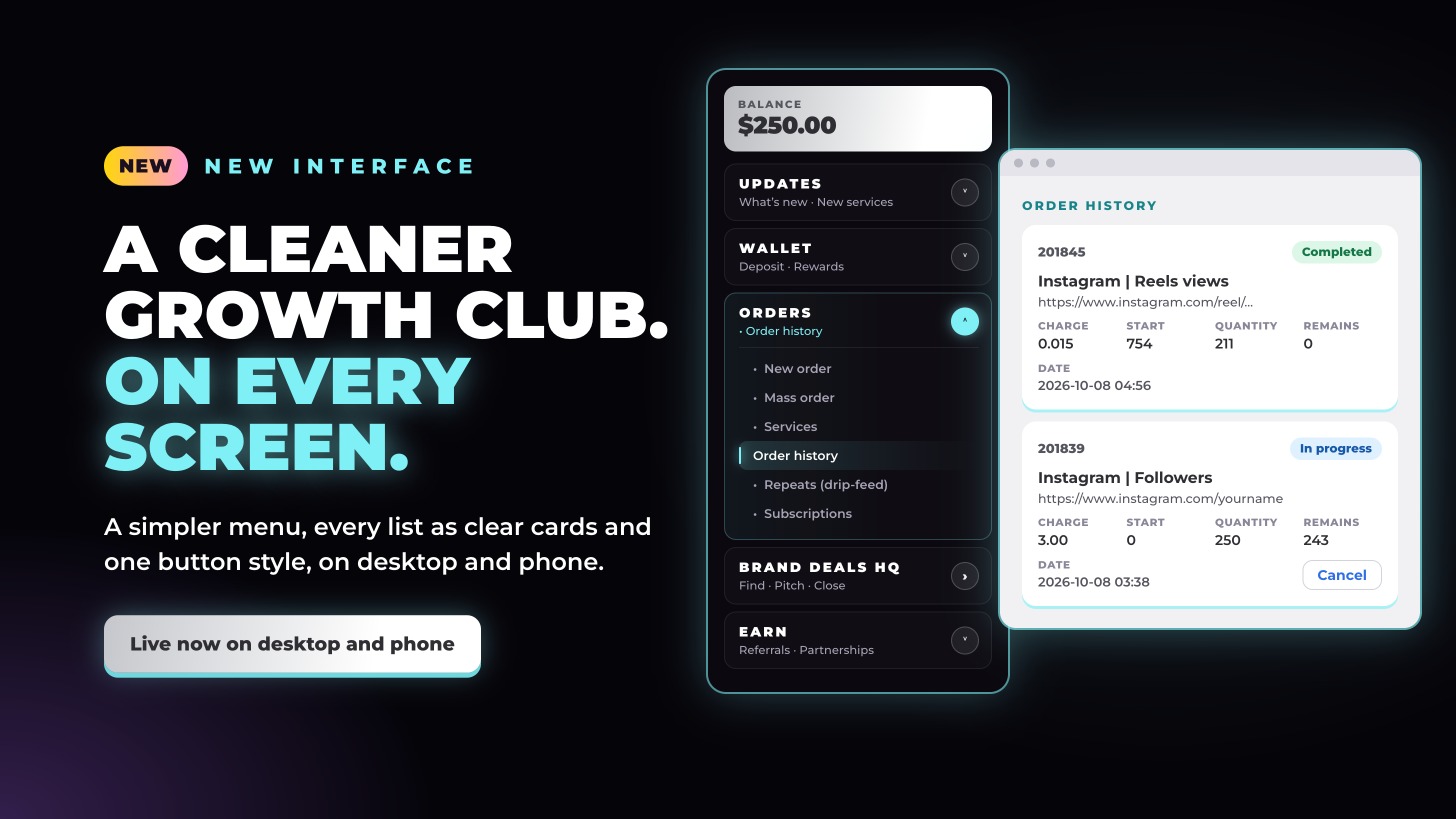
Growth Club has a cleaner interface on desktop, tablet and phone. A simpler menu, every list shown as clear cards, one style of button and tidier service descriptions. Your services, prices, orders and balance are exactly the same.
A simpler menu
- Updates first. What’s new and New services now sit together at the top.
- Ordering in one place. Services moved into Orders, next to New order, Mass order, Order history, Repeats (drip-feed) and Subscriptions.
- One section open at a time. Open another and the last one closes, so the menu stays short.
Every list is now cards
Order history, Repeats, Subscriptions, Services, New services, Deposit history, Refunds, Rewards, Referrals and Support show each line as its own card: the ID and status at the top, the service name in bold, your link, the numbers with clear labels, the date at the bottom and any buttons on the right.
- Statuses at a glance. Green for completed, blue for in progress or active, amber for partial, pending or paused, red for cancelled or failed.
- One style of button. Cancel, Refill, Unpause, Reorder, Details, View and Order look and work the same everywhere.
- The same on every screen. One card per line on desktop, tablet and phone, and it adjusts when you zoom in or out.
New order and Mass order
The guide on the right now starts level with the page title, and service names and prices in the service list are bold, to match the categories.
Tidier service descriptions
Every service description follows the same layout: the start time first, then exactly what to enter, with example links underneath.
There’s nothing to set up: same services, same prices, same balance, just easier to use.